This post originally appeared on Single Grain, a growth marketing agency focused on scaling customer acquisition.

As marketers, we’re always trying to get more leads for our businesses.
But the problem is that all the traditional paid traffic channels are only getting more expensive. The average cost per click on Google Adwords is around $1-$2, with the most expensive ads costing $50 or more.
This means that the average small business spends over $100,000 on AdWords alone each year.
Facebook ads are still relatively underpriced, but they’re rising quickly: average CPC is around 40 cents worldwide, an increase of about 10 cents from 2015.
With the rising cost of paid traffic, it’s important to hit all the “low-hanging fruit” when it comes to boosting your lead generation — and conversion rate optimization is the best way to identify and fix problems that already exist.
By making your conversion flow more efficient, you’ll increase your numbers without spending any extra money, which means that you’ll see a higher ROI on your existing investment.
In this post, we’ll show you how to run conversion rate optimization (CRO) tests on your website, what tools you should be using, and show you a few CRO case studies.
The first step to getting started with CRO is auditing every step of your marketing funnel. Without gathering data, you’re just guessing on what changes you should make, which means that you’ll waste time and effort on tests that don’t get you more leads instead of learning something that will boost your ROI.
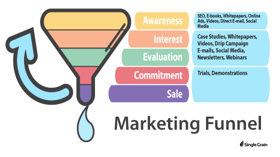
What you want to do is gather data in a both quantitative and qualitative way.
Quantitative data helps you break down the numbers at each step in your funnel and figure out where the leaks are, while qualitative data can give you some deep insight into the real pain points of your customers. This can help you refine your marketing copy across the board and boost conversions.
Learn More: Step by Step Guide: How to Build a High Quality Marketing Funnel
Here are some ways you can start measuring qualitative and quantitative data:
Google Analytics is a simple way to figure out how many people are dropping off at each step of your funnel and where the biggest leaks are. By measuring the data around your funnel, you can get better insight as to the cause of confusion for your customers at certain steps.
But first, you’ll need to set up conversion goals and funnels in Google Analytics.
Your conversion funnel in Google Analytics will show you what “flow” users go through on your site. Here’s an example of what this might look like if you’re trying to measure your order flow:
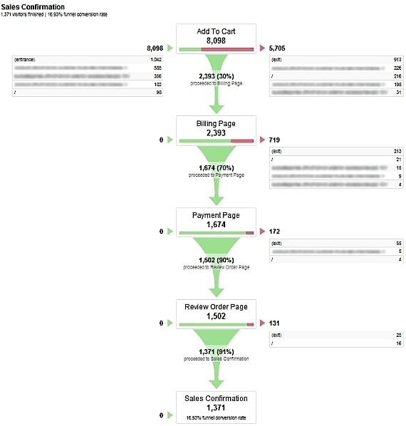
Source: KISSmetrics
In the image above, users first add an item to their cart, move to the billing page, then to the payment page, then to the order review page, and finally to the sales confirmation page. It’s pretty easy to see that the largest drop off here between the “add to cart” stage and the billing page.
When it comes to optimizing conversions, you can see that it’s pretty straightforward: you’d focus on reducing cart abandonment. No guesswork here.
Learn More: How to Set Up Goals and Funnels in Google Analytics
One of the biggest wins you can get when it comes to CRO is optimizing your marketing copy. By making your copy more targeted to your audience’s specific pain points, you’ll increase the likelihood that they’ll stay on your site longer — more so than if you just made design changes.
Surveys are a great way to understand how to optimize your marketing copy. You can use tools like Qualaroo (to survey your website visitors) or SurveyMonkey (to survey your audience from your e-mail list or another source).
For example, here are some survey questions that we asked our audience (via SurveyMonkey) to see how we could improve our marketing course, GrowthVault.
We matched each survey response to demographic categories with the following questions:
What revenue range does your business fall under?
How many employees does your business have?
These questions are designed to elicit open-ended, story-like responses. From there, we can pick the right stories and write compelling copy to get more customers.
Usability tests are great to see what barriers prevent users from placing orders or completing a specific call to action on your site.
You can get a group of “test” users who are part of the same demographic as your ideal customer and give them a set of tasks to perform on your site — such as going through the process of placing an order. You can either watch them or have them record their screen as they’re going through this process and have them “think” out loud as they’re figuring out what to do.
Chances are you’ll find that certain areas of your site are hard to navigate or have unnecessary friction.
A quick way to conduct usability tests at once is by using a site like UserTesting.
UserTesting has a wide range of testers from different demographics. To make sure that you’re getting the right people looking at your site, you can create filters and screener questions. For example, you can have people answer what industry they work in before they go through your website.
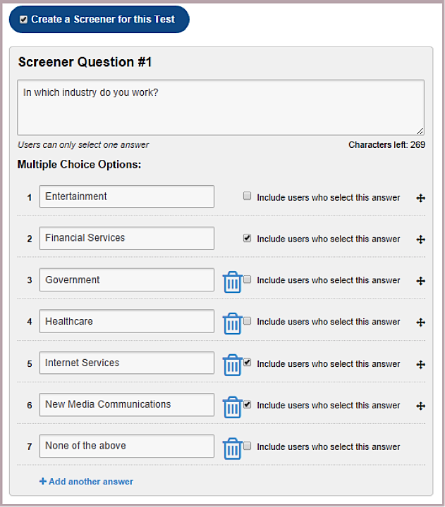 Source: UserTesting
You can also set your demographic filters by criteria like age, gender, country, and even what device they should use.
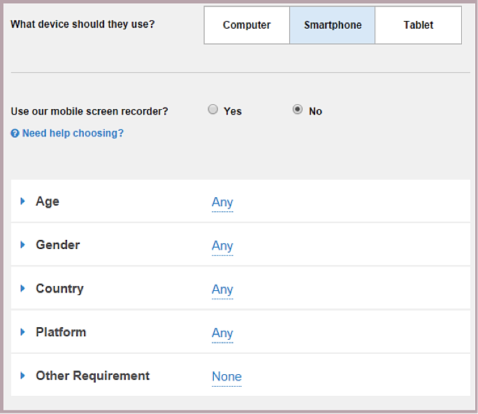
Source: UserTesting
Depending on how much traffic you’re getting to your site, a small increase in conversion rates could result in massive amounts of revenue.
For example, Brookdale, a senior living solutions website, was able to boost their monthly revenue by $106,000 just by replacing the home page banner video with an image when they realized that their target audience was not as likely to watch video.
Just by changing the copy of their CTA, Lifeproof was able to boost their monthly revenue by 16%.
Conversion rate optimization is one area of marketing where small changes can result in huge boosts in revenue over time. In this section, we’ll talk about how to run an A/B test.
There are variety of tools out there today that let marketers run A/B tests without needing to know how to code. Here are some examples:
Which tool you use isn’t as important as being able to run a large number of tests as fast as possible.
According to Instapage, here are some major page elements you should consider testing when running landing page tests:
One of the biggest mistakes that marketers make is trying to be clever instead of being clear in their copy. This is especially true for headlines. You only have 10-20 seconds to attract users with your headline, so while you might think that being clever will make your post sound more interesting, it actually just adds more complexity — and complexity reduces conversions.
By making their headline more clear, Movexa, a supplement company, was able to to boost their conversions by nearly 90%.
Their original headline copy looked like the following:
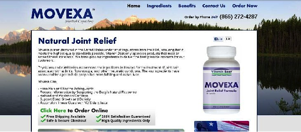
The headline said “Natural Joint Relief.” The hypothesis was that if they added the word “supplement” to their headline copy (so that it said “Natural Joint Relief Supplement”), it would add more clarity to what the offer is and what the company does.
Once they tested this hypothesis through a variation page, they found that it did indeed beat the control by 89.97%. This just goes to show how even a small amount of vagueness in the headline can reduce your conversions drastically. Be sure to optimize for clarity over cleverness or design.
Adding a well-placed call to action is a small tweak you can make on any site to increase conversions.
For example, Consolidated Label, a food label manufacturer, tested a new web page design with a prominent call to action. Their original web page didn’t have a clear call to action:
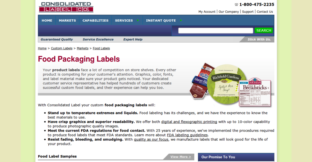
They tested a variation page with a more prominent call to action, which asked visitors to request a quote:
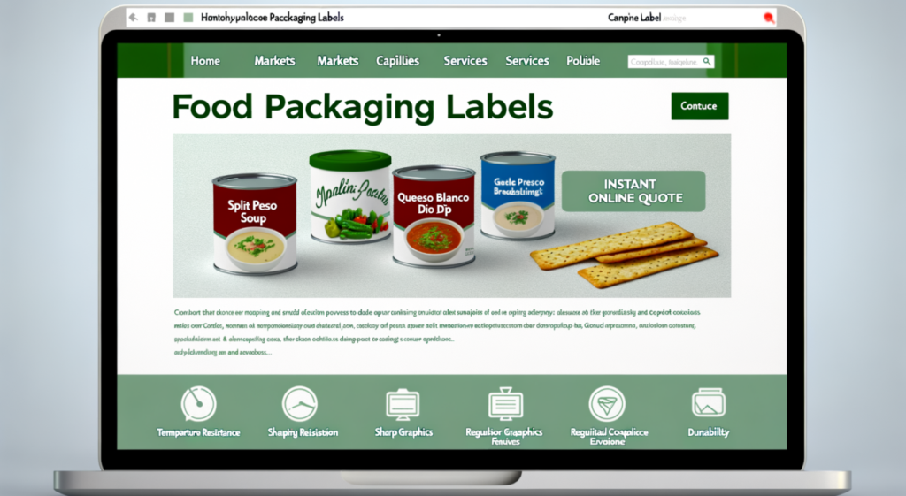
If users can’t tell what they’re supposed to do once they get to your page, then it’s likely that your call to action isn’t prominent enough.
Once Consolidated Label tested this variation, they noticed a 62% increase in conversions.
Learn More: How To Create CTAs that Actually Cause Action
Most marketers think that short copy is better. We’ve had it beat into our heads that people don’t have long attention spans, and that the only way to get anyone to take action is by keeping all your copy — landing page, e-mail copy, etc. — brief.
The truth is, shorter copy isn’t always better for conversions. In some cases, longer is better. For example, if you’re selling a high-priced product, then you’ll need to build a longer, deeper relationship with your users before they can trust you and be willing to transact with you.
Even your headline copy can benefit from lengthier rather than shorter.
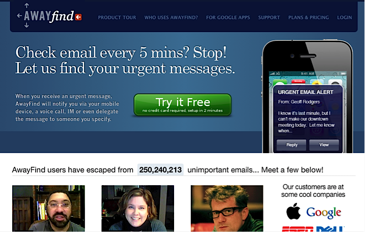
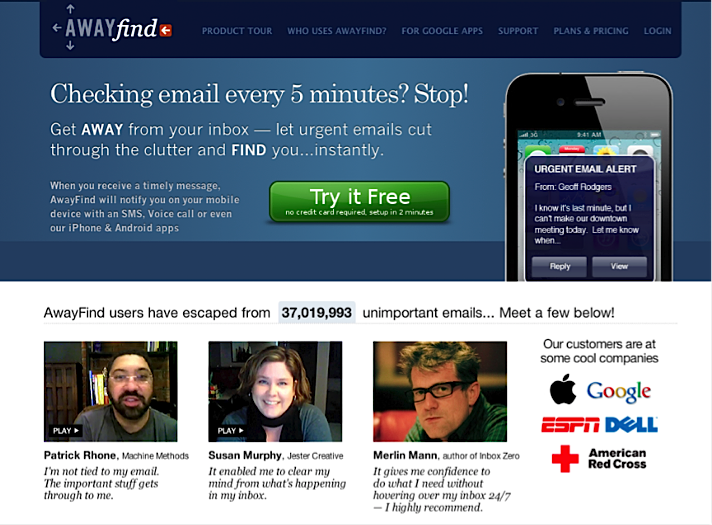
Check out these two versions of a landing page:
Version A
Version B
Most people would think that Version A resulted in higher conversions because of the cleaner design and shorter copy on the hero image.
However, version B increased conversions by 38%. The reason for this is because the additional sub-heading highlights key features of the product in bold lettering, which makes the features easier to see. Reading “let urgent e-mails cut through the clutter and find you instantly” is more compelling than “let us find your urgent messages.”
At the end of the day, of course, the more clear and direct you can make your copy, the more compelling it will be, no matter the length.
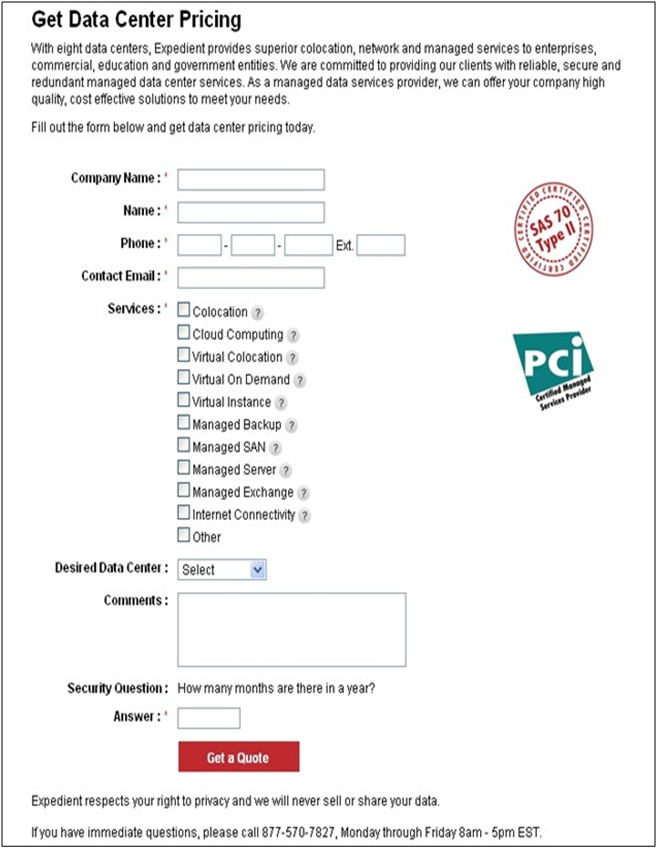
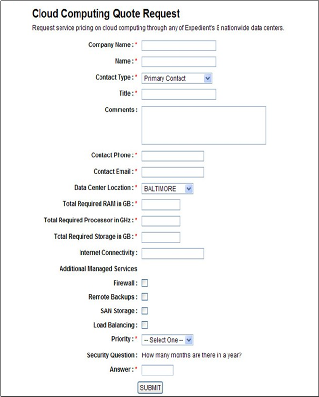
The more friction that stands between users completing an action, the less likely they are to complete that action. Requiring unnecessary fields on a form is one of the quickest ways to reduce the number of conversions you get on your site.
You can also increase conversions by allowing users to check boxes instead of entering text, since this takes less effort.
For example, this B2B company boosted their number of leads by 368.5% just reducing the amount of text users had to enter and changing their button color on the form.
Version A
Version B
What works best on landing pages isn’t always obvious.
There are many competing factors that determine whether people convert or not. Simplicity matters (which you can get through short copy), but clarity matters, too (which might require longer copy).
Giving users the information they need about your business is important (i.e. through an explainer video), but it’s also important to reduce the number of options that are available on the page.
The best way, overall, to get better conversion rates is to figure out exactly what your audience wants, be as clear and compelling as possible, and then test it.
What are some interesting CRO test results that you’ve seen in the past? Let us know in the comments below!
Enter your email to get free instant access